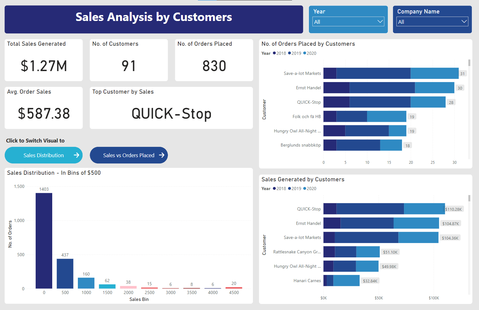
Creating visuals
After the data was cleaned and transformed, I created the visuals for the dashboard. As I was in charge of analysing the customers, these are the areas I needed to focus on as stated by the requirements:
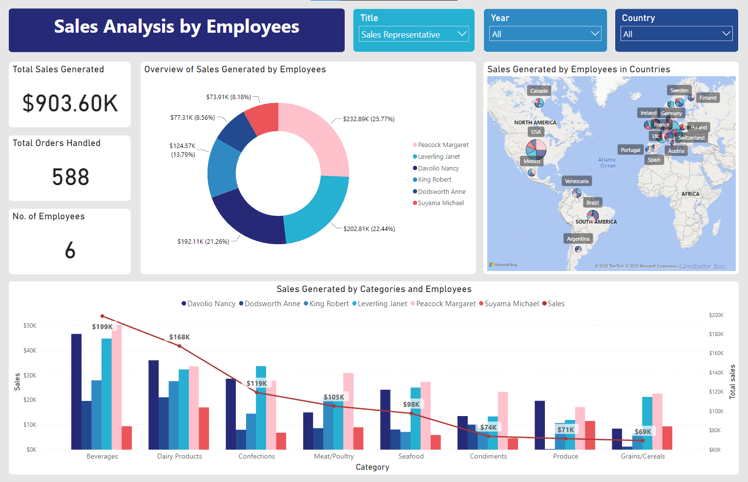
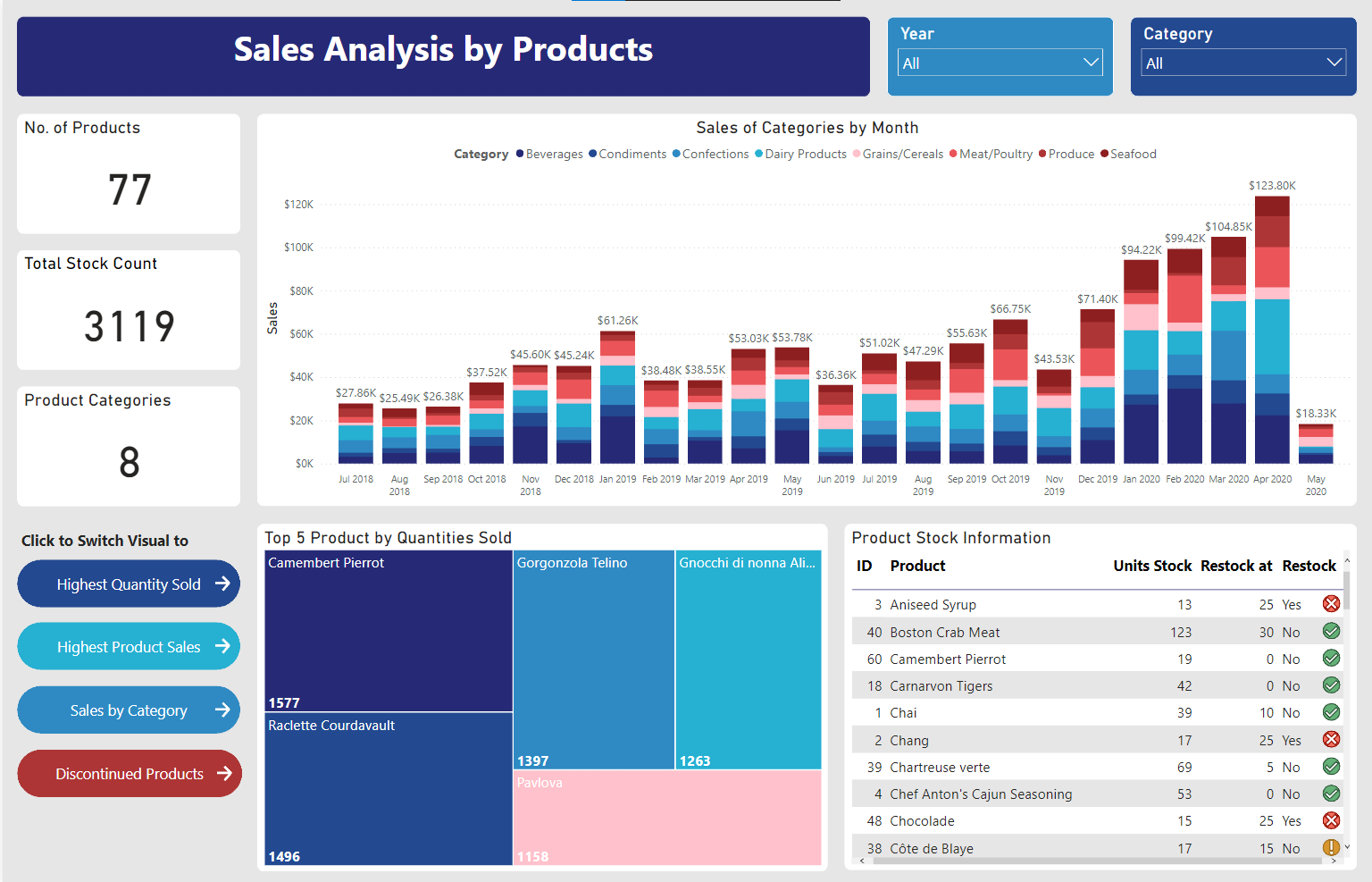
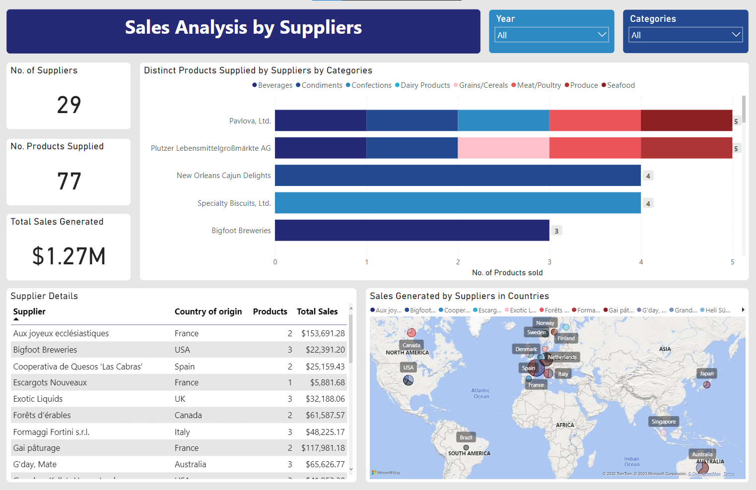
- A visualisation showing the sales in bins of $500 for all the orders. Sales amounts above $4500 will be grouped under one bin
- A visualisation showing the number of orders placed by each customer
- A visualisation showing the sales amount gained from each customer.
- Include necessary filters to enable users to filter the data.
With the above requirements in mind, I created the following visuals:
Deeper Analysis
We were also required to perform deeper analysis on the data to provide more insights to the company and to help them make better business decisions. The following are the insights I came up with:
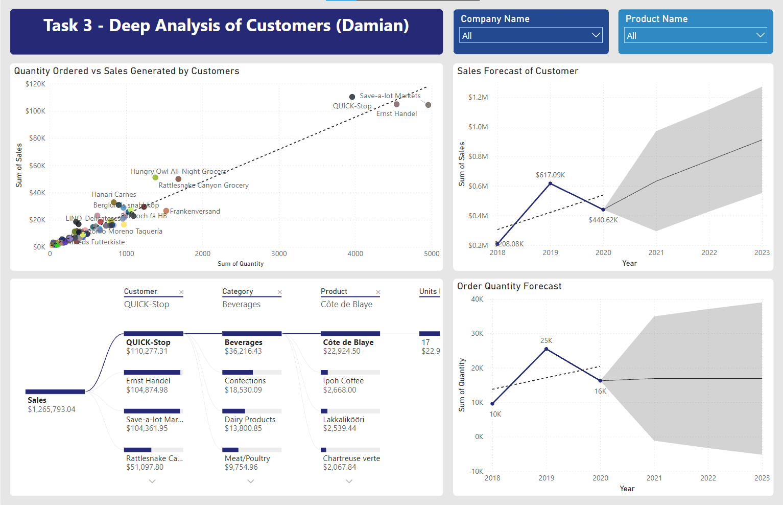
With the above visuals, I came to the following conclusions:
"In conclusion, as the earlier scatter chart suggests, sales generated by each customer is closely tied to the quantity of products they order, therefore, it is crucial to maintain a sufficient inventory to maintain and drive-up sales figures."
Integration
The final step is to integrate the visuals into a single dashboard and to ensure that the visuals are easy to comprehend and navigate.